Loading
NEW DESIGNERS ADDED WEEKLY!
The best pattern designers.
Browse & hire professional surface pattern designers for fashion, textiles, interiors & product design.
Browse & hire professional surface pattern designers for fashion, textiles, interiors & product design.
We use cookies to improve your experience and understand how PatternDesigners is used.
Discover pattern styles, motifs & structures used throughout surface pattern design, with visual examples to help you recognise every pattern type.

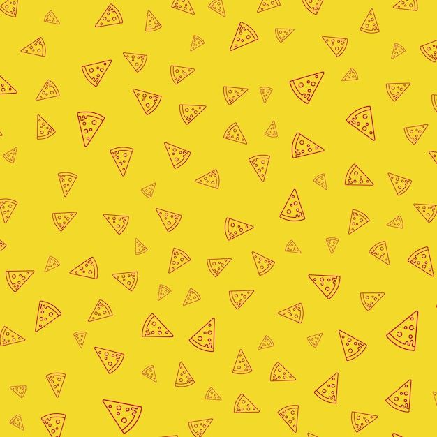
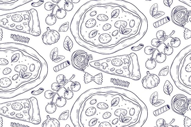
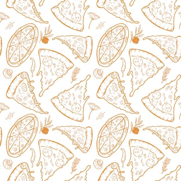
Pizza pattern is a conversational, food-themed motif drawing on visual conventions developed in pizza branding and packaging: a hunger-triggering colour palette, a small set of recurring geometric shapes (triangle, circle, square), and typography choices that signal price point and authenticity. The source discusses this vocabulary in the context of logo and packaging design rather than repeat surface pattern specifically, but the same colour and shape vocabulary transfers directly to a pizza-themed print.
Pizza pattern is a conversational, food-themed motif drawing on visual conventions developed in pizza branding and packaging: a hunger-triggering colour palette, a small set of recurring geometric shapes (triangle, circle, square), and typography choices that signal price point and authenticity. The source discusses this vocabulary in the context of logo and packaging design rather than repeat surface pattern specifically, but the same colour and shape vocabulary transfers directly to a pizza-themed print.
The dominant motif is the pizza slice (triangle) and the whole pie (circle), often paired with secondary elements such as a pizza box (square), melted cheese, and toppings. Designers use these three core shapes deliberately: the triangle to suggest direction and movement, the circle to suggest community and sharing, and the square to suggest stability and structure (as in packaging). Typography in the branding source ranges from bold rounded serifs and hand-drawn script (signalling warmth, tradition, and artisan quality) to chunky geometric sans-serifs (signalling speed and modernity) - a useful reference point for lettering paired with a pizza-themed print.
The source does not describe repeat-layout conventions for a pizza surface pattern; its structural content concerns logo and packaging composition (e.g. shaping the crossbar of a letter "A" into a triangle, using negative space to combine a pizza slice with another silhouette) rather than an all-over repeat.
Pizza branding uses a strongly codified palette: red (dominant, raises urgency and appetite), yellow and orange (melted cheese, warmth, approachability), green (fresh ingredients, basil, authenticity), and black and white (used by modern/artisanal pizzerias for a more sophisticated, minimal look). This gives a pizza-themed pattern a ready-made, recognisable colour logic rather than an open palette choice.
The source does not give a history of pizza as a food or as a design subject; it describes current branding and packaging design practice (drawing on examples such as Pizza Hut, Domino's, and independent pizzerias) rather than a historical design tradition.
The source itself addresses logo, packaging, and brand identity design rather than textile or repeat surface pattern. It provides transferable colour and shape vocabulary (red/yellow-orange/green/black-white; triangle-circle-square) that a novelty food print could draw on, but does not document pizza pattern's use in fashion, home textiles, or stationery specifically.
Pizza pattern is a conversational, food-themed motif drawing on visual conventions developed in pizza branding and packaging: a hunger-triggering colour palette, a small set of recurring geometric shapes (triangle, circle, square), and typography choices that signal price point and authenticity.
The dominant motif is the pizza slice (triangle) and the whole pie (circle), often paired with secondary elements such as a pizza box (square), melted cheese, and toppings.
The source itself addresses logo, packaging, and brand identity design rather than textile or repeat surface pattern.
g. shaping the crossbar of a letter "A" into a triangle, using negative space to combine a pizza slice with another silhouette) rather than an all-over repeat.
g. a slice merged with a clock, or with a local landmark) - a branding device rather than a repeat-pattern motif
Pizza branding uses a strongly codified palette: red (dominant, raises urgency and appetite), yellow and orange (melted cheese, warmth, approachability), green (fresh ingredients, basil, authenticity), and black and white (used by modern/artisanal pizzerias for a more sophisticated, minimal look).
The source does not give a history of pizza as a food or as a design subject; it describes current branding and packaging design practice (drawing on examples such as Pizza Hut, Domino's, and independent pizzerias) rather than a historical design tradition.