Loading
NEW DESIGNERS ADDED WEEKLY!
The best pattern designers.
Browse & hire professional surface pattern designers for fashion, textiles, interiors & product design.
Browse & hire professional surface pattern designers for fashion, textiles, interiors & product design.
We use cookies to improve your experience and understand how PatternDesigners is used.
Discover pattern styles, motifs & structures used throughout surface pattern design, with visual examples to help you recognise every pattern type.

Retro patterns are not a single pattern type but a stylistic mode that borrows visual conventions from earlier decades. In surface pattern design, "retro" typically references the aesthetics of the mid-20th century: the bold graphics and atomic motifs of the 1950s, the psychedelic colour and organic forms of the 1960s and 1970s, and the domestic print vocabularies of the immediate post-war period. The defining characteristic is intentional historical recall - the pattern signals its era of reference rather than trying to appear contemporary.
Retro patterns are not a single pattern type but a stylistic mode that borrows visual conventions from earlier decades. In surface pattern design, "retro" typically references the aesthetics of the mid-20th century: the bold graphics and atomic motifs of the 1950s, the psychedelic colour and organic forms of the 1960s and 1970s, and the domestic print vocabularies of the immediate post-war period. The defining characteristic is intentional historical recall - the pattern signals its era of reference rather than trying to appear contemporary.
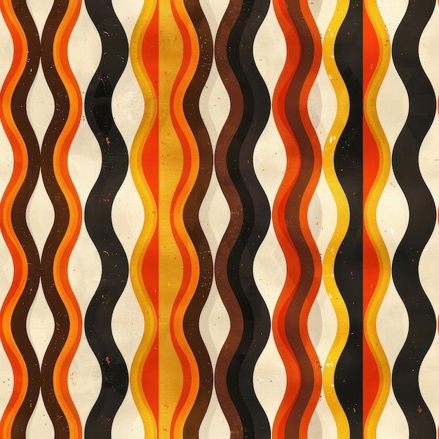
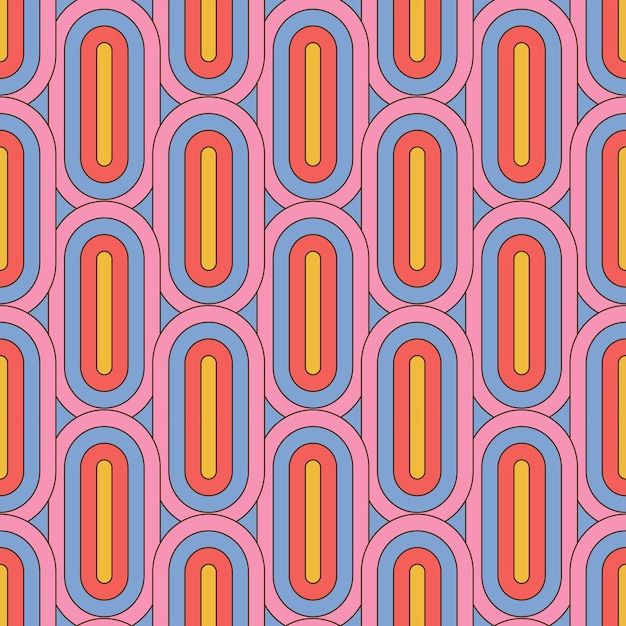
Retro patterns are characterised by: reduced colour palettes (typically 3-5 colours, referencing pre-digital print limitations); flat graphic rendering without gradients or photorealistic shading; and period-specific motifs. Typography or lettering drawn from period graphic design conventions is also common. Palette choices are particularly diagnostic - avocado green, harvest gold, burnt orange, mustard, and brown combinations immediately read as 1970s; black, white, red, and pink as 1950s; acid yellow, orange, and teal as late 1960s.
Retro patterns follow standard repeat structures (block, half-drop, stripe) but their graphic quality - flat colour, period motifs, reduced palette - is what signals their historical reference. 1950s atomic and starburst patterns often use a toss or scattered layout; 1970s patterns frequently feature large-scale organic forms and bold interlocking shapes.
Period-specific motifs associated with retro aesthetics include:
Palette is the primary signal of retro styling. Key period palettes:
The overall aesthetic quality is graphic and legible; retro patterns tend to be readable at a glance and avoid visual complexity that would require high production quality to reproduce.
The concept of "retro" in design refers to aesthetic nostalgia - a deliberate stylistic look backward at the recent past, as distinct from historical revival (which looks further back). Art Nouveau (organic, curvilinear), Bauhaus (functionalist, geometric), and Art Deco (geometric, decorative, luxurious) are earlier 20th-century movements whose visual vocabularies were drawn on in mid-century design and subsequently recycled as retro references. Mid-century modern design (1940s-60s) is currently the most commercially active period reference in surface pattern retro styling.
Retro patterns are not a single pattern type but a stylistic mode that borrows visual conventions from earlier decades.
Retro patterns are characterised by: reduced colour palettes (typically 3-5 colours, referencing pre-digital print limitations); flat graphic rendering without gradients or photorealistic shading; and period-specific motifs. Typography or lettering drawn from period graphic design conventions is also common.
Heritage
Retro patterns follow standard repeat structures (block, half-drop, stripe) but their graphic quality - flat colour, period motifs, reduced palette - is what signals their historical reference.
Geometric
Palette is the primary signal of retro styling.
The concept of "retro" in design refers to aesthetic nostalgia - a deliberate stylistic look backward at the recent past, as distinct from historical revival (which looks further back).